
We all have uniform takes, and we are all totally convinced that ours are the correct ones.
I, for one, can generally be defined as a traditionalist. A team's colors should be their only colors. While new designs should always try to innovate, being different is not in and of itself a merit, and one should not sacrifice looking good for the sake of being different. A lot of uniforms that survive from generation to generation, or are resurrected after dalliances with whatever is "in" at a given moment, do so because traditional choices tend to look good. The basic tenets of design have existed for a reason.
Minnesota's current uniform set debuted in 2018 the second year of P.J. Fleck's tenure as head coach. It was unveiled on the ludicrously named hyprrelite.com, showing off garish "dart gold" helmets and the supposed ability to mix-and-match just about every part of the uniform, regardless of how a given combination looked. (It's a good thing that we've never seen anthracite jerseys on gold pants on the field.)
At the time, I was not a fan of the set. With time, and the memories that come with it, I have come to appreciate these uniforms. Not to love them, but to see their merit.
Generally speaking, that is. I am nothing if not a pedant and a nerd. I've been designing sports uniforms on my computer or in a sketchbook for years, and I have my own ideas of how to correct the Gophers' current aesthetic.
Rather than burning it all down and starting over, though, I think there are just a few adjustments you can make. Adjusting an element or two, and modifying how each element is deployed, can make the whole set better looking and more cohesive. As long as Fleck is head coach, there's no removing the "Row the Boat" stuff entirely, and the Gophers are going to try and wear 13 different uniform combinations in a season. But we can find compromises here and there, tweaking one part or emphasizing one look over another, all within the conventions of the current uniforms. We can also put in provisions to avoid uniform matchups that don't complement each other perfectly, or to maintain traditional looks in games with history.
/cdn.vox-cdn.com/uploads/chorus_image/image/52876511/120943092.0.jpg)
Is this exercise self-indulgent? Fully. But it's the offseason, and we have to find something to do.
Helmets
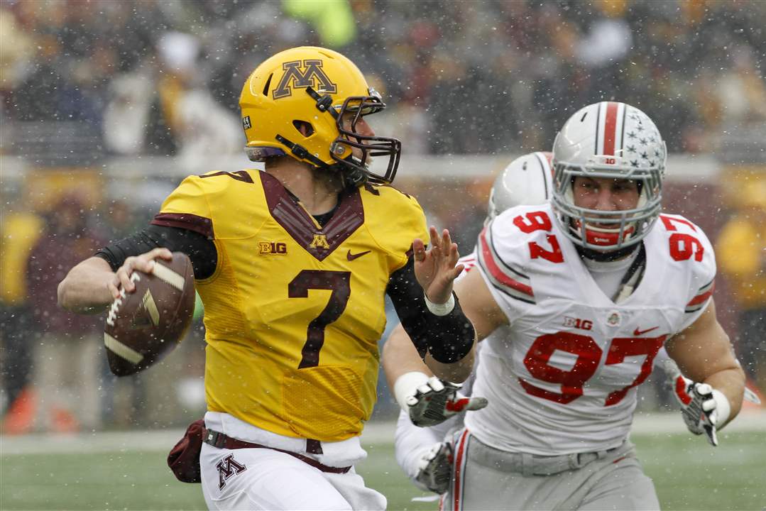
As part of Fleck's apparent policy of wearing something different every game, the Gophers switch their helmets every week. On top of a few bedrock templates, the team usually builds upon them with slight derivations. One week, they wear maroon with plain gold decals; the next, it's chrome gold with predominantly white elements; the next, it's back to maroon, but with gold facemasks and gold numbers on one side of the helmet; and so on. The result of this desire for constant change is the constant introduction and recycling of bad ideas and underutilization of good ones.
The first thing I expect from a football helmet is symmetry. The Pittsburgh Steelers get a pass because of tradition, but otherwise, there's seldom a good reason to not wear the same thing on both sides of your helmet. Oversized logos are also a bad choice.
/cdn.vox-cdn.com/uploads/chorus_asset/file/22119897/091817spFb0917g_10.jpg)
From a Minnesota helmet specifically, I require that the logos and striping predominantly use maroon or gold. Grey and black should not ever be a part of the equation, except maybe on the facemask. White should exist only as a trim color if it's there at all. (White might be bad luck, anyway.)
Additionally, we should avoid jingoistic one-off designs. No stars-and-stripes, no camouflage, and absolutely no invoking the Twin Towers. This goes for every sports team in America. There's no good reason to do this, aesthetically or ideologically. It's like making a textile version of Lee Greenwood's "God Bless the U.S.A.": grating and politically gross.
Here, then, is how I would clean up Minnesota's selection of helmets. The graphic below contains the seven options that I believe should comprise the rotation. I've also included guidelines of when each helmet should be deployed. Every little sticker the Gophers wear on the backs of their helmets — Sid Hartman, H.E.R.E., etc. — does not appear in the graphic, as adding them all would have taken me more time than was worthwhile. (Because the rest of this post can only be described as purely worthwhile.)
 |
| Click to enlarge. |
Maroon A: The best version of the Gophers' current helmets. Plain gold decals with snazzy, retro-feeling gold facemasks reminiscent of the Lou Holtz era.
Maroon B: The current version of the Gophers' most frequent helmet style since the late 70s. Maroon facemasks with gold decals. It's not flashy, but it's just about impossible to find fault with it, and it can be worn as part of any uniform combination.
Maroon C: The same as Maroon A, but with metallic gold stylings rather than the traditional look. The style worn against Northwestern and Wisconsin in 2019, at Illinois in 2020, and again versus Wisconsin in 2021. From the wrong angle or when it's not yet dark, the M or facemask can look a bit pale, but the different texture usually creates a cool effect after the sun goes down.
Gold A: Gold, but with white trim inside the M decals and in the stripes. The first gold helmets Minnesota wore that weren't leather featured maroon and white striping and a white stroke around the M. It's since been replicated on subsequent helmets and other applications, including some gorgeous hockey sweaters. Fleck has brought back this look in recent years, and it's looked tremendous. It's seldom been deployed with symmetry, but it's arguably the Gophers' best road helmet when viewed from the side featuring the M.
Gold B: A familiar gold helmet featuring maroon decals. A version of this helmet served as the alternate look under Jerry Kill.
Gold C: Featuring a charging Goldy Gopher and maroon facemasks and stripes. Charging Goldy, easily the best representation of Goldy on a Minnesota helmet, first made his appearance at Fresno State in 2019. He's since appeared against Iowa the following year and in the bowl win over West Virginia, though the latter instance was on a maroon shell. Even I, a grouchy old man at heart, have come to appreciate this helmet — except that it has never been symmetrical. I don't understand why not. The M on Goldy's sweater doesn't look like any other letter when flipped horizontally. Just reverse him so he's facing forward on each side, and you have an unimpeachable helmet.
The first appearance of Minnesota's mascot on a helmet was in 2017 against Middle Tennessee State, which was in observation of Goldy's birthday. Reviving that idea would be a little hokey, but it seems like as good an occasion as there could be to wear a cartoon gopher on a football helmet.
Chrome Gold: I am not a big fan of chrome football helmets. But when the program's biggest win in decades came while wearing the best version of the Gophers' chrome gold look, I suppose I had to warm up to them a little bit. White trim on the M and stripes makes each element stand out against their reflective background better than plain maroon does. It also recalls Vegas gold looks from the past: when Tony Dungy was quarterback, as well as when the Gophers sported those outlandish Apex uniforms in the 90s, the logos were maroon with white trim. When Minnesota sticks to this version of chrome gold, and limits conflicts with splashes of traditional gold, it can be a sharp look that is well-suited for important matchups.
Jerseys
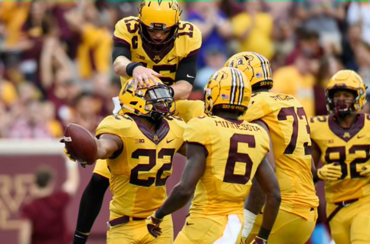
I have warmed considerably on Minnesota's main jerseys since they were introduced. I prefer gold numbers but have come to like the white outlined in gold; as the temperatures drop over the back half of the season, they feel fittingly wintry. I was skeptical that such heavy use of white could work for the Gophers after the excellently spartan Kill uniforms, but to an extent, I have been proven wrong. (We'll get to one way in which I haven't changed my opinion.)
Black and grey jerseys, though? Those unsightly things should never have come into existence. Minnesota's actual colors are magnificent, and any school in the country can follow the trend of wearing black or grey for the sake of trendiness. (Most have at least dabbled in it.) Throw them in the woodchipper.
So we'll keep the other jerseys that are here, with minimal edits, and update the option that should be the Gophers' only alternate.
 |
| Click to enlarge. |
Maroon: Identical to the Gophers' current maroon jerseys, but with one important alteration: The collar, currently white, is filled in with maroon. The choice to use white has peeved me for a long time. It would be one thing if collars on football jerseys (especially those made by Nike) were thin like those on a T-shirt, but they're just so large. If the collar uses a different color than the body of the jersey, it's going to stick out. That can be a good thing — contrast is important — but some aspects of a color palette are best kept as trim rather than taking up serious real estate. If the Gophers wore white helmets and pants, a white collar wouldn't be a problem. It creates disunity, though, when maroon and gold are the headgear options. Switching to maroon would go a long way in improving Minnesota's aesthetic.
Gold: Maroon numbers, cuffs, and collar with white trim. The gold jerseys that Kill's regime introduced are fine — "MINNESOTA" nameplate aside — but their reappearance at the open of the 2019 season was a weird decision, considering the Gophers' move to a new template. (Maybe the money spent on grey and black uniforms could have gone to updating the gold look?) The collar was clunkily shaped and bore an ugly "Flywire" pattern when the jersey was introduced, and it looks more out of place in 2022. The numbers are missing the outlines featured on the other jerseys. The old gold jerseys' presence disrupts the cohesion of the total uniform set, and the Gophers need a replacement in their current template.
In my design, the M on the collar is maroon, with the inside lined in white, as on Gold Helmet A. If the Gophers wanted to, they could pair that helmet and their gold pants to revive the short-lived all-gold combination. It's certainly loud, but it looked okay the first time and could be a fine annual or biennial selection.
White: Unchanged from the current jersey, just with a maroon Nike swoosh and recolored Big Ten logo. Minnesota's white jerseys are basically as good as one could ask for.
Pants
It is hard to screw up a pair of pants. Many teams in the last few years have taken to not featuring any design on their pants, which is boringly safe but also usually works. At the very least, it's an improvement on some of the weird striping we saw in the late 2000s and early 2010s.
The Gophers have gone with stripeless pants for most of their history, going back to that look during the Kill era. There are few changes to make with the pants that are currently in the rotation; the biggest two are removing any options that aren't maroon or gold. If Minnesota ever wore Murray Warmath-era throwbacks on an annual basis, white pants could come back for that purpose. But not for general use, as they have tended to make the rest of the uniform look less like one belonging to Minnesota.
 |
| Click to enlarge. |
Maroon: Featuring the gold M with a maroon interior stroke, which is unchanged from the current pants. These are worn a little too often with maroon jerseys for my liking, but the all-maroon look is usually very good.
Gold: Featuring the maroon M with a white interior stroke, which is a change from what has normally been there. Usually, the M has had a gold interior stroke. However, since I see the gold helmet featuring the white-trimmed M as the team's best gold helmet, I wanted to unify it with the pants. Therefore, to maintain consistency, these gold pants are not to be worn with Gold Helmet B, which has the gold trim on its logo. Additionally, as with the gold jersey, there's no wearing gold pants with chrome or metallic gold elements.
The position of the M and Nike swoosh have also been changed to the front of the pants. The Gophers' gold pants have had these logos on the sides since 2013, and their continued presence there (even as the maroon pants changed) leads me to believe the team never switched pants at all with the 2018 refresh. Moving the logos would be a small correction for the sake of unity.
:format(jpeg)/cdn.vox-cdn.com/uploads/chorus_image/image/21816661/20131026_lbm_aj5_074.0.jpg)
Overall Thoughts
I've referred to different potential combinations, both permitted and otherwise, throughout this post. For the sake of completeness, and so you can see how each element plays off each other, here is a chart displaying all allowed possibilities.
 |
| Click to enlarge. |
There are five regular home uniforms and four regular away uniforms that would appear every season, plus an additional 17 potential combinations. Many in the latter category are slight derivations from the main combinations, where a helmet decal or facemask is swapped, and reside in the third column of the above chart. The second column is for the uniforms that would be worn most years, though the aforementioned guidelines for use still apply.
In other words, if the Gophers could still wear a different uniform every game if they really wanted to do so. But their uniforms would stick to their actual colors of maroon and gold, with their best looks set aside for more regular use.
No comments:
Post a Comment
Note: Only a member of this blog may post a comment.