
One of my sub-hobbies as a part of my sports fandom has for many years been the sport's aesthetics. Since I drew my first uniform concepts in elementary school, a lot of other people have caught onto this sub-hobby, too. Now, uniforms are a part of the business of college football; some teams wear something different every week to draw the attention of recruits.
 One of my sub-hobbies as a part of my sports fandom has for many years been the sport's aesthetics. Since I drew my first uniform concepts in elementary school, a lot of other people have caught onto this sub-hobby, too. Now, uniforms are a part of the business of college football; some teams wear something different every week to draw the attention of recruits.
In 2019, the Gophers were one of those teams. They wore 13 different uniform combinations in as many games. For content's sake, I present my reviews and rankings of those 13 combinations.
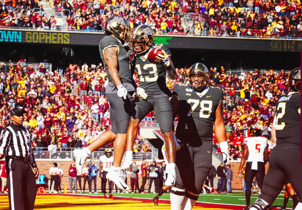
13. Chrome gold/anthracite/anthracite (vs. Maryland)
 |
| Minnesota Athletics |
Every iteration of Minnesota's anthracite uniforms has been worse than its predecessor, establishing a new aesthetic low for the program each time. The original monstrosities worn against Michigan in 2015 at least featured a speck of maroon outside of the hardly distinguishable collar and cuffs, which the 2017 edition lacked. The 2018 Indiana game marked the debut of the garish chrome helmets, and the jerseys removed gold from much of the trimming in favor of a neutral white, making it nearly impossible to tell what team you were watching.
This season, the equipment staff used grey and white helmet decals. That made them easier to see against the chrome helmets' glare, but it made the uniforms even more drab. Like other shades of grey, anthracite is far too dull to use as the base of any football uniform, and it makes Minnesota look like a team other than Minnesota.
12. Maroon/white/white (at Iowa)
| Jeffrey Becker, USA Today Sports |
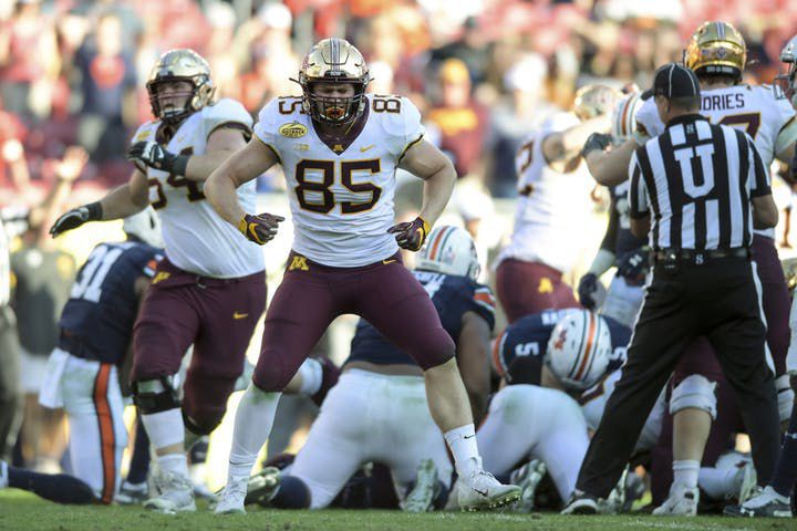
11. Maroon/maroon/maroon (vs. Nebraska)
/cdn.vox-cdn.com/uploads/chorus_image/image/65524526/1175479169.jpg.0.jpg) |
| Hannah Foslien, Getty Images |
Helmet designs featuring a logo on one side and a number on the other emerged near the end of the 2000s. It was a tacky idea from the beginning; the only football team that should wear asymmetrical helmets is the Pittsburgh Steelers, who get a pass only because of tradition.
Fortunately, by 2019, the fad had just about died out. At the FBS level, the only place it seemed to persist was Boise State. Chrome helmets are trendy. Grey uniforms are trendy. Asymmetrical helmets, though? They were trendy when today's players were in middle school. They're neither aesthetically appealing nor fashionable. So by putting an M on the rights of their helmets and a number on the lefts, the Gophers both made themselves look worse and didn't give themselves any coolness points. It was a confusing choice.
10. Chrome gold/white/maroon (vs. Auburn)
 |
| Aaron Lavinsky, Star Tribune |
The Gophers will forever have multiple positive memories with this color combination after wearing it in historic wins over Wisconsin in 2018 and Auburn on New Year's Day 2020. It's still a suboptimal choice, however. Using multiple kinds of gold on the uniform lessens its cohesiveness, and chrome remains too gaudy.
There's also the issue of asymmetry. This year of Gopher uniforms revived one of the mistakes of 2017: a decal I call Ghostface Goldy. Oversized helmet logos are another trend that looked dumb from the beginning and never should have stayed, and if the Gophers are going to wear Goldy on their helmets, his image would certainly look better in full color. As is, it's tacky.
That said, the uniform is not horrible overall. Maroon pants add a fine splash of color that both makes this look more interesting than maroon-white-white and makes it easier to identify the team. Though the specific gold is wrong, the uniform has balance and logical progression from top to bottom; the white in the middle is offset by color above it and below it.
9. Gold/white/maroon (at Rutgers)
 |
| Noah K. Murray, USA Today Sports |
Replace the chrome gold from No. 10 with regular gold, and you have No. 9. I call that a significant improvement, but Ghostface Goldy still drags down the helmets.
8. Gold/maroon/gold (vs. Illinois)
 |
| Bruce Kluckhohn, AP Photo |
There's nothing wrong with this color combination. In previous years, gold/maroon/gold has been one of Minnesota's best looks. There's nothing wrong with the helmet. The M is on both sides, and the maroon facemask complements the gold shell well. The color scheme looks great against Illinois' navy/white/navy, too.
.JPG)
The thing holding this uniform back is the design of the jersey. There's no white anywhere on the helmet or pants, but there's white on the jersey. White numbers aren't ideal but are fine, and the white cuffs are small enough to not be a distraction. The white collar, however, is a problem. It holds back other versions of the Gophers' home uniforms because of how large it is (an issue with most modern football jerseys), but it is especially glaring with the gold helmets. Gold is a bright and bold color. When it takes such a prominent role in a uniform, the other parts need to be dark so as to let the gold do the work. Most of the jersey does that, but the collar demands one's attention away from the gold, and the uniform feels unbalanced. Fill it in with maroon, and the whole set improves, but this combination gets particularly better.
7. Maroon/maroon/maroon (vs. Wisconsin)
 |
| Elizabeth Flores, Star Tribune |
The Gophers have made all-maroon work before, even with the current uniform set. This time didn't work as well, however, because of the helmet details. In the right light, the M could look really good, but the metallic gold elements just looked pale and out of place next to the traditional gold bits on the jersey and pants — as well those on as the band and cheerleaders' uniforms, the field design, every Gopher fan's clothes, and the signage and graphics throughout the stadium. Using multiple shades of a secondary color is an easy way to lose consistency.
6. Maroon/white/maroon (at Northwestern)
 |
| Aaron Lavinsky, Star Tribune |
The Gophers wore the same helmets against Wisconsin that they did the week prior in Evanston. The uniform overall was a little better because Minnesota's road jerseys are better than their home jerseys, but their helmets still worked against them. A mostly sunny day exacerbated the paleness of the metallic gold elements.
5. Chrome gold/maroon/maroon (vs. Penn State)
 |
| Jesse Johnson, USA Today Sports |
A small bonus: Instead of a more over-the-top commemoration of Veterans Day, the Gophers wore a tiny decal that one could easily have missed. (Fleck wore it as a patch.) Sports in America (and American culture in general) have a problem showing patriotism in a subdued way, but this was tasteful.
#Gophers to wear helmet decal on Saturday that recognizes the Armory on @UMNews campus. https://t.co/qJmTl720LU#SkiUMah // #RTB pic.twitter.com/arZY04UCf3— Minnesota Football (@GopherFootball) November 7, 2019
Maybe the moment is affecting my opinion, but I like these uniforms.
4. Gold/white/gold (at Fresno State)
 |
| Cary Edmondson, USA Today Sports |
This uniform is so close to being great, but a helmet gimmick gets in the way. On the left side of the helmet, the Gophers wore the M, but on the right side, they wore the "Charging Goldy" logo. Unlike other combinations dragged down by asymmetry, however, these helmets' only sin is being asymmetrical. Charging Goldy was a surprisingly solid helmet logo. The matte finish is another nice touch. Though putting Charging Goldy on both sides would break from tradition, it would make for an undeniably fantastic helmet.
/cdn.vox-cdn.com/uploads/chorus_image/image/65219781/usa_today_13327896.0.jpg)
3. Maroon/gold/maroon (vs. South Dakota State)
 |
| Jesse Johnson, USA Today Sports |
When Minnesota got new uniforms in 2018, the set really should have included a gold jersey. This season, the Gophers revived the gold look, but they had to go back to the Kill-era gold jerseys, with a tacky early-2010s Nike flywire collar and "MINNESOTA" on the back instead of a name. In addition to the problems that existed when the jerseys originally entered the rotation, there was also a problem of consistency: The design template for the new set doesn't match that of the old one. The color combination is great, but this look needs some slight updates to work as part of a cohesive uniform set.
2. Maroon/maroon/gold (vs. Georgia Southern)
 |
| Jesse Johnson, USA Today Sports |
The Gophers wore their signature color combination just once this season, and that's an absolute shame because it looks so good. The gold facemask is a small touch that somehow makes it look a lot better, too. Even the white jersey collar cannot drag down this uniform that much. I'd rank this uniform first if not for the stupid asymmetrical helmet. When the M is on each side, there's no better Minnesota color combination than this one.
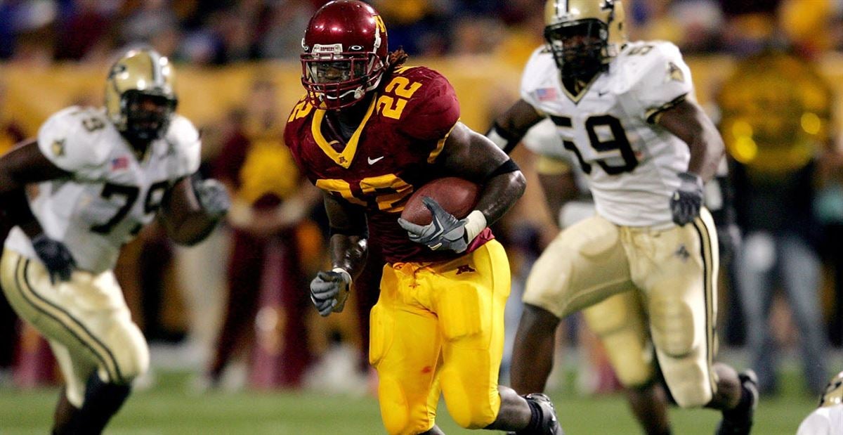
1. Maroon/white/gold (at Purdue)
 |
| Michael Conroy, AP Photo |
This is near-perfection. The gold facemask, not worn on a maroon helmet since Lou Holtz was coach, pops against the darker shell. The classic M adorns each side of the helmet. The gold pants are the Gophers' best. The white jersey has the right balance of maroon and gold, which was one of the weaknesses of the previous set.
This is one of the classiest road uniforms in college football. This is Minnesota.
No comments:
Post a Comment
Note: Only a member of this blog may post a comment.